How are watercolour sets created?
As an artist, seeing a watercolour set gives me vivid images of all the painting possibilities, so when I started making my own paints, I wanted to give other artists this same feeling of wonder when they look at the sets I create. On a practical level, it is a more focused approach of working because there are so many colour possibilities and making paint for a particular set makes it easier, so here are few methods that I consider in creating a complete watercolour set.
Watercolour sets from a range of relevant materials
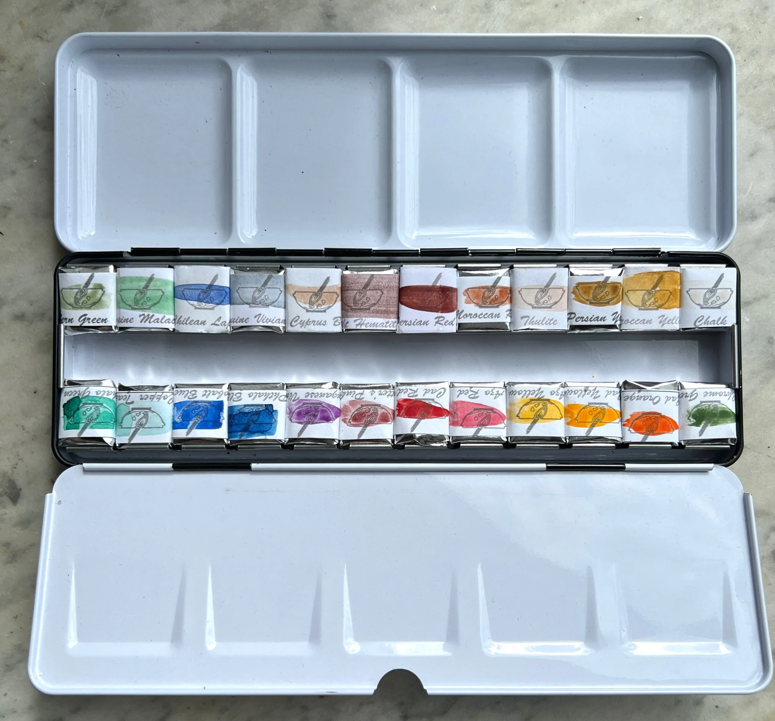
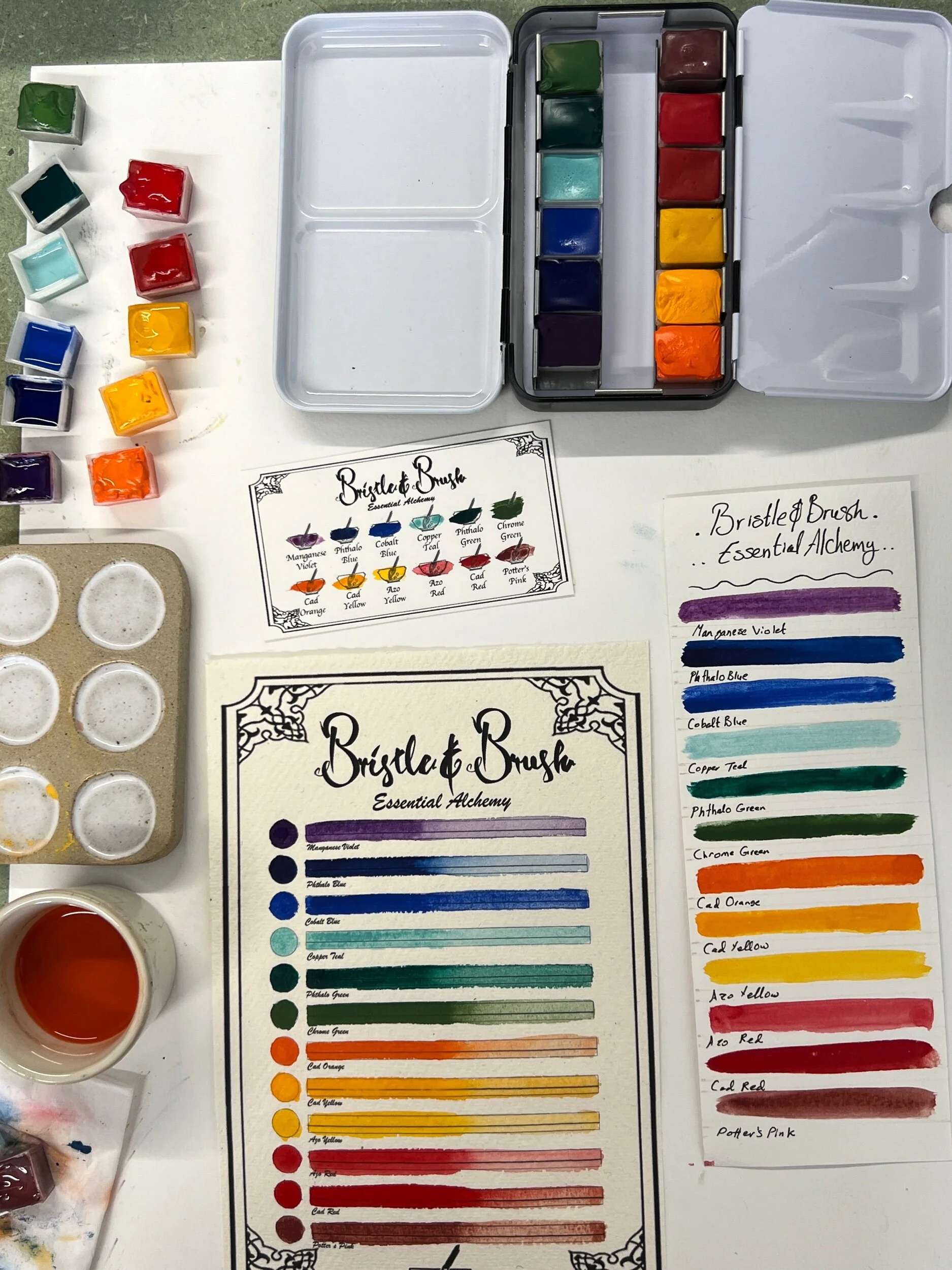
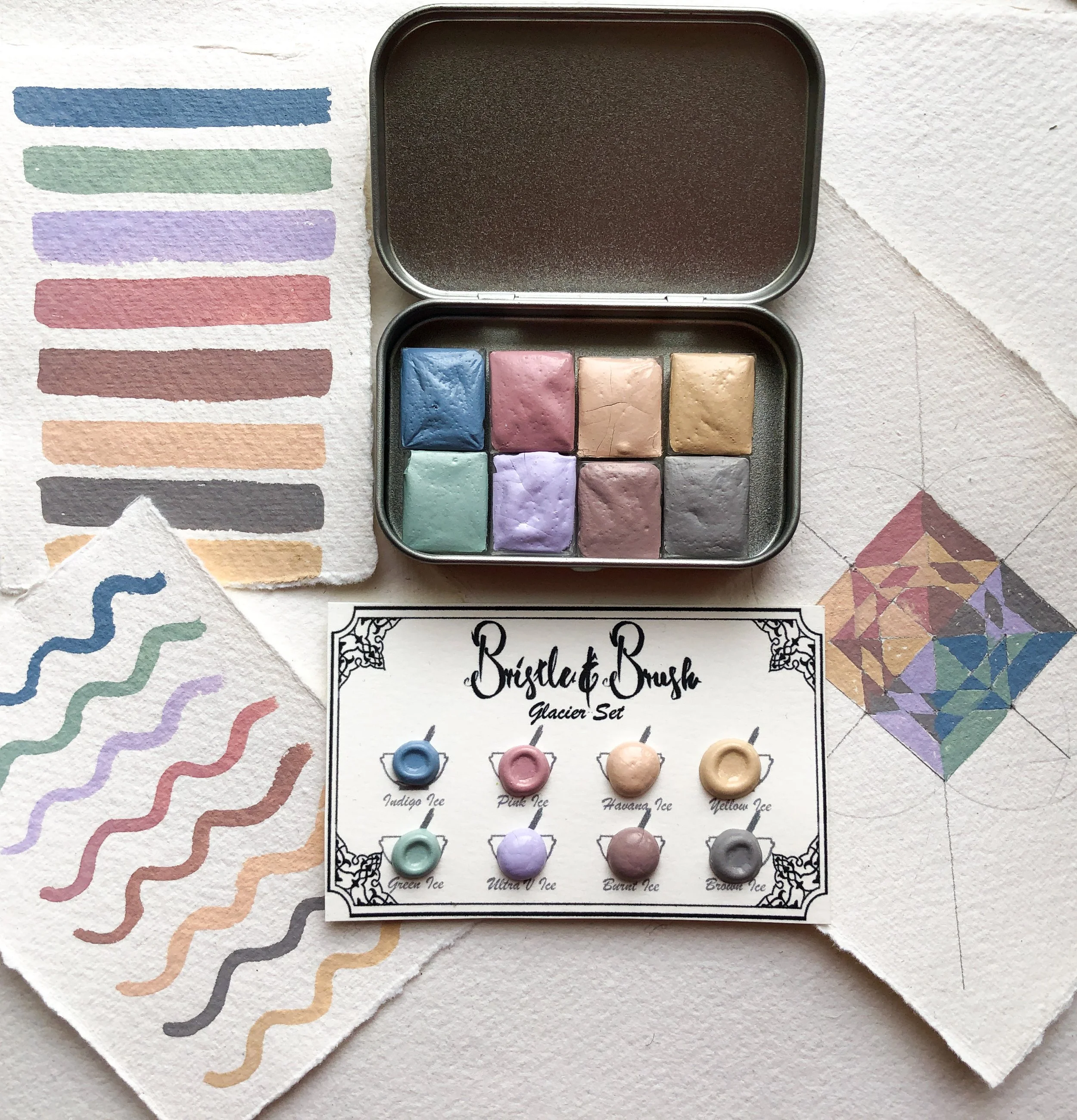
When I started Bristle and Brush, I knew I wanted to have a variety of materials especially minerals, but they require a budget of their own. Mineral pigments are not cheap! So, I decided to start with the humble Earth and create a set to house a range of French and Italian soil/earth that range from brown to green. It was my first experience grouping colours together in a set and thankfully they worked. The colours also looked very cute in a little sea shells. If you are wondering why I use seashells as pans, please read: Sustainable Watercolour Pans.

After a few months of business I was brave enough to invest in a bigger quantity of mineral pigments to create the gemstone set that included: Azurite, Thulite, Jade, Green Opal, Green Jasper and Red Jasper. They looked really complementary to each other and an artist who uses them could say that they are only using minerals in this piece.


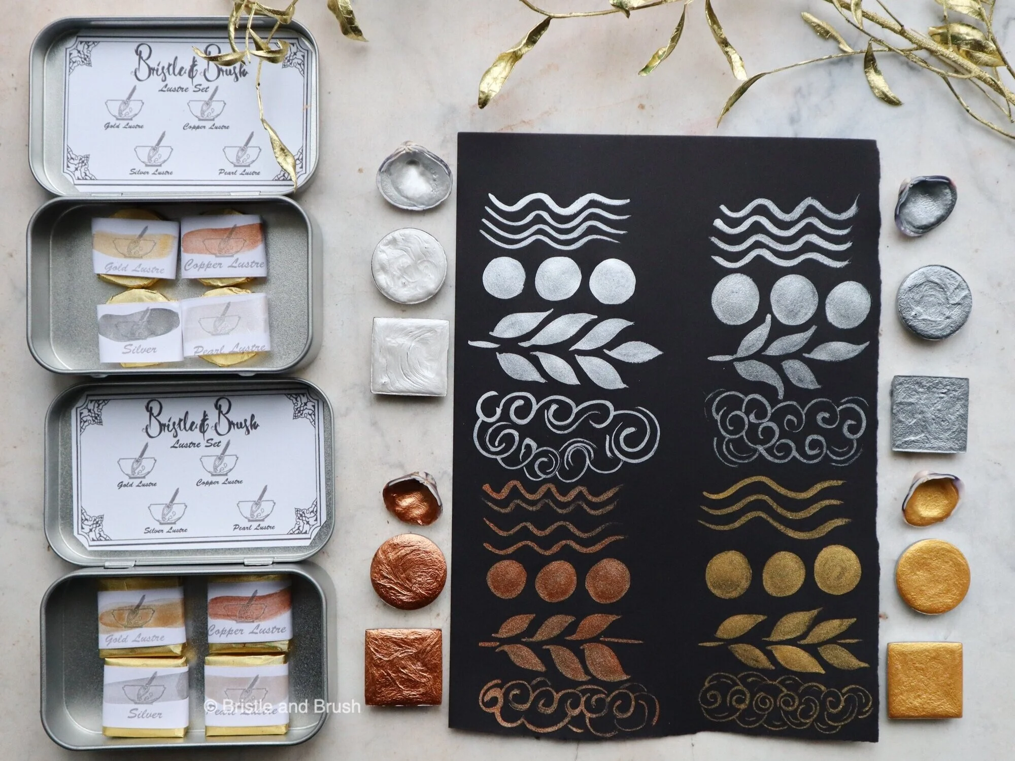
I tried this method a third time as well when I grouped metallic shimmery watercolour in one lustre set that included: pearl, silver, gold and copper. That was more fun than expected, which makes sense why metallic watercolour makers are so popular. I made it limited to only four shimmers though because they give a lot of variety and can be mixed with over variation of paints.
Watercolour sets for a painting project
This feels like a nice and natural ways to create watercolour sets and I bought pigments that were dedicated to a specific painting project in the past. It feels like you get the watercolour set and lots of painting ideas ready with it. Even though I love nature painting and flower projects, there was one particular project close to my heart and it is illumination specially the Islamic Illuminated scripts. This lead me to create the Modern Illumination Set 1 and it includes the basic colours that you would see in an illuminated manuscript and it included: dark hematite (dark red-ish brown), smalt (dark blue), white titanium, lamp black, gold lustre and verdigris (light turquoise). I later revamped the same set and made Modern Illumination Set 2, where I swapped smalt for ultramarine blue (nicer consistency), lamp black for vine black (more even coverage) and cobalt turquoise instead of verdigris (doesn’t burn your paper from its vinegar content!). My students that I teach illumination to love this set because it has all the colours they need for so many lovely combinations and it is a cheaper alternative than using the genuine 23ct gold and genuine Afghan lapis lazuli.


Watercolour sets for a cause
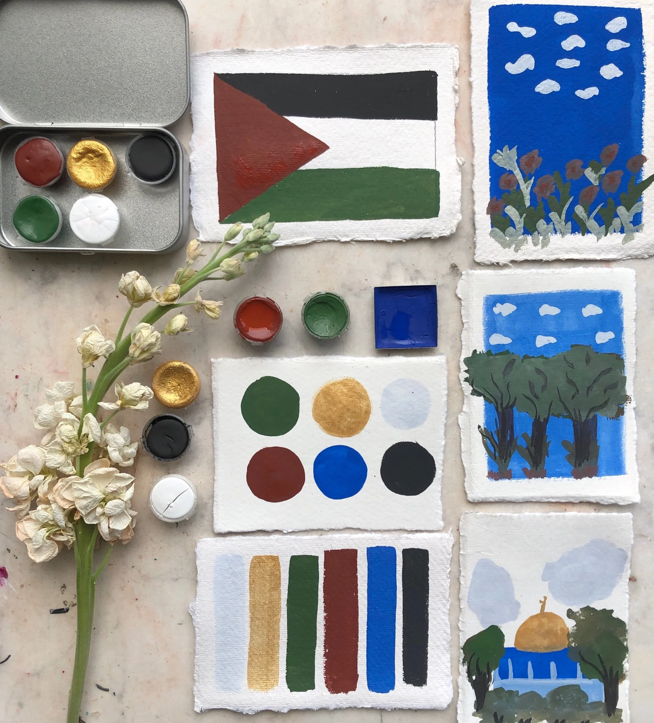
This grouping was not something I was planning on and I actually did not realise I could create a watercolour set like that until the apartheid of Palestine got worse and I wanted to do something to help them and paint is the only way I know how. The colour inspiration is directly from the flag and some of the iconic things from there. It is a limited addition, but I felt so emotionally connected to it.
I am still developing more ways to create other paint sets and groupings, but each one brings its own joy with it :)
More reads from the blog:


Shop Bristle and Brush Paints: