How to choose the right watercolours for you?
In my previous post, I told you how watercolour sets are created, which lead me to think of how you could choose the right watercolour arrangements for you! There is an abundance of watercolour options out there and choosing a brand or a specific set can be challenging if you are like me and want to try everything but worried you will have too many things that you don’t use. The good news is that most watercolours do not expire so you can keep them for years to come, but that does not mean you have to buy everything all at once! In this post, I am going to give you some tips to make this hard decision of choosing the right watercolours slightly easier.

Choosing watercolours changes based on your preference, the actual colour, the type of material you want to use, the surface/finish of the painting and even your budget, so let’s break it all down first. This is about you and what you want to give the world, so I will be reminding you of also trusting yourself and what you like instead of only listening to the expert’s advice.
Your Personal Preference
Again, this is all about you, so you can look into your own life of what are the colours you have in your living space? What are the colours that grab your attention when you are out and about? What colours do you wear?
Also, you need to look at your art practice over and over again, what colours do you tend to use? What colours do you think of? Are you trying to keep that artistic style or do you want to get out of your comfort zone?

Watercolour Colour Options
Primary Watercolours
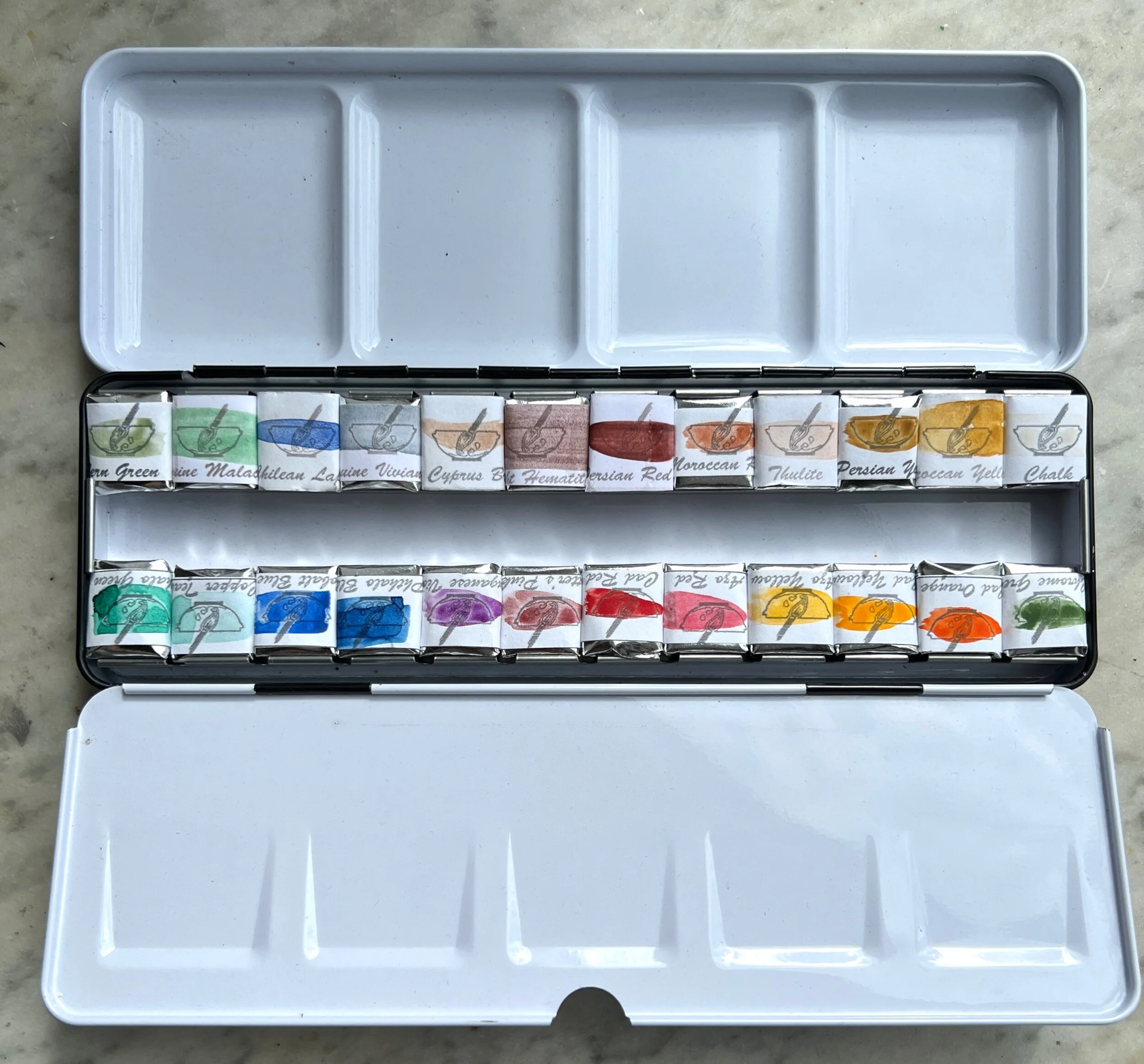
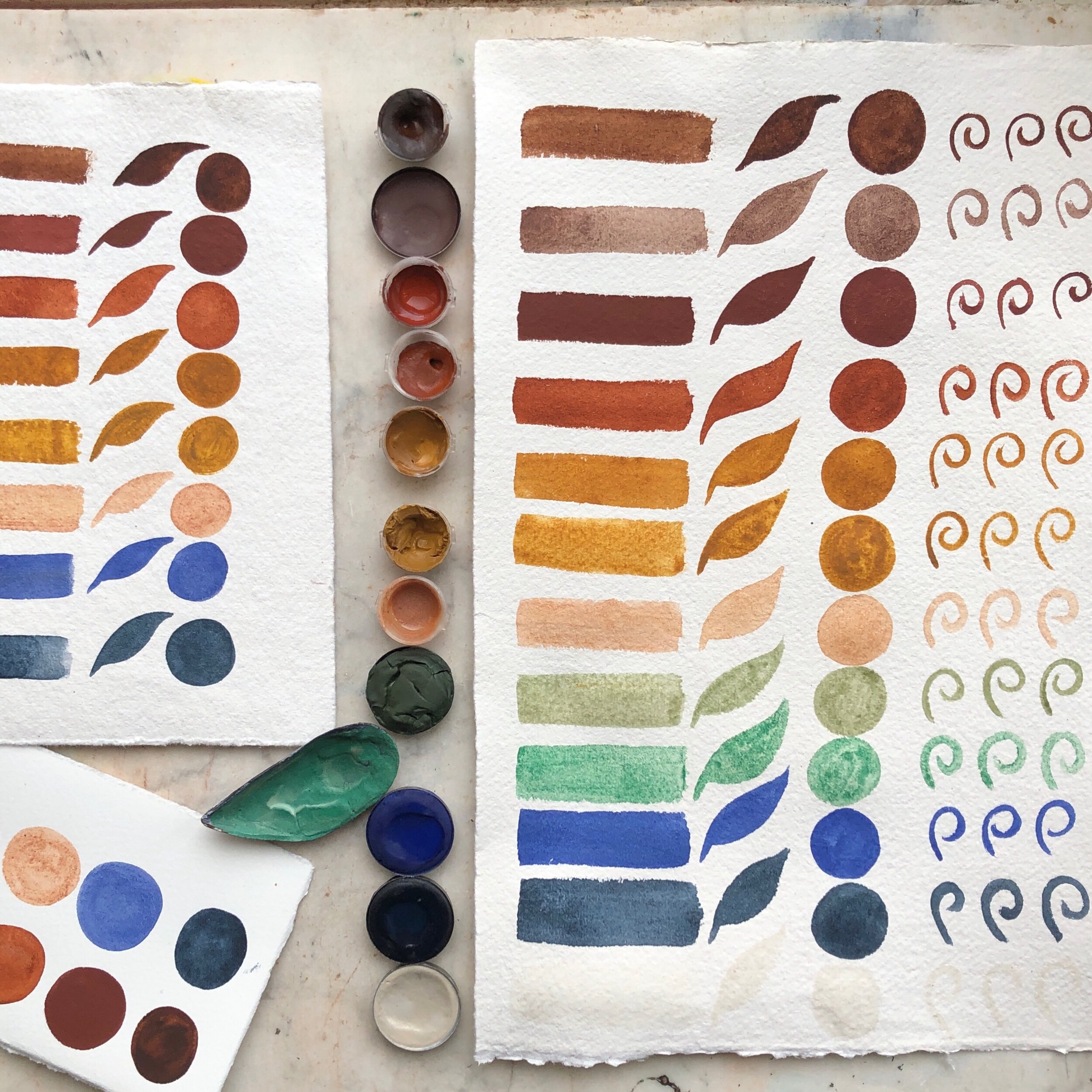
The primary watercolour is a good way to start when you feel that you are not sure what to choose. Primary watercolours are: blue, red and yellow. When you look that up online it is the brightest and truest form of those colours without any added components or other hues, so you can follow that or choose a lighter or a darker shades of those primary. It might feel weird advising you to only start with three colours, but starting small and then building your collection is always good when you are starting out.
Primary watercolour suggestions you might like: Venetian Red or Carmine, Yellow Ocher and Cobalt Blue.

Secondary Watercolours
If you feel like three colours are not enough to launch your creative paintings, you can add three more: orange, green and purple/violet. They are produced by mixing two of each of primaries. They can come in handy if your primaries are expensive or precious and you do not want to use them for mixing. If you are some natural pigments, mixing colour is sometimes not very straight forward and you might not achieve the outcome you want.
Secondary watercolour suggestions you might like: Orange Havana (it is a softer orange and close to the yellow ocher), for green you have few options: Chrome green if you wanted that spot on forest green or if you want a natural green you can try Green Earth 1, which is my favourite green to work with, or Green jasper. If you want a green with a very a yellow undertone then Green opal or Bern Green Earth are both nice options. For the purple/violet, I have two options: Ultramarine Violet and Cobalt Violet.

Project based Watercolours
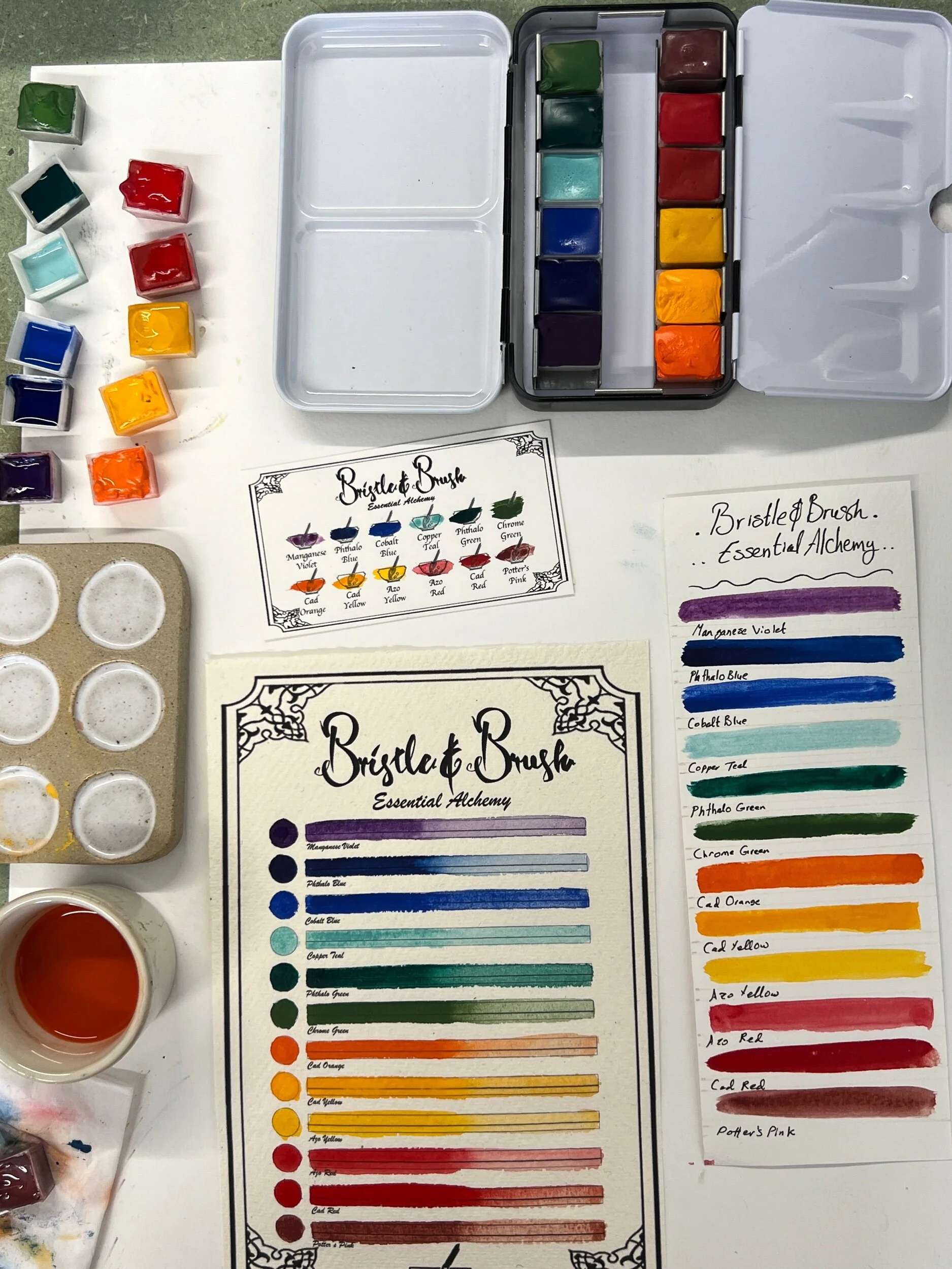
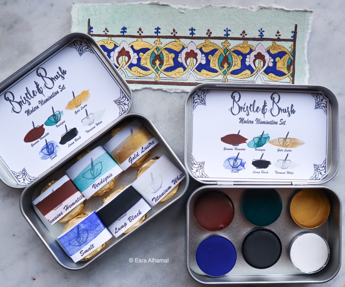
Having a watercolour project or a specific piece you want to complete will inspire the colours you want. If you are painting a watermelon you know you would want a red, green, white and black. So, think of what art projects or subjects that you are likely to paint and think of the colours these projects contain. For example, if you are one of my illuminated manuscripts students, then you would want a range of specific colours that include: shimmery gold, a dark red, a dark blue, a white and a black, which leads you nicely to the modern illumination set that includes these colours.
Watercolour Paint Material & Surface
I am not sure how much artists think of the material and source of watercolour, but I know a few who only want to paint using natural pigments, where other artists are opening to trying human inventions in colours, so it might be a good idea to consider the material you want to help you make a decision. The material choice also impact the surface of your painting. This might be important to you or not, but I think it is worth mentioning here.
Only ochers and Earth pigments
There is a particular charm with using only earth pigments and how accessible they feel and with earth paints you can do so many lovely natural scene and little nature projects like flowers, mushrooms and woods and so on. The surface of earth paint is so nice and smooth. However, earth pigments do not contain any blues, which might be a little challenging and that takes me to my second material and it is minerals.

Only minerals and gemstones
Minerals are also a natural material and genuine gemstones can be crushed to a powder and that is mixed into watercolour paint. The most precious minerals are usually blues because they are hard to get and they are quite expensive such as Lapis lazuli, Azurite and Vivinite. There are also green (malachite, green opal and green jasper), red (red opal and red jasper) and pink (thulite 1 and 2) minerals! The minerals have been used heavily in Islamic Manuscripts, for example the 16th century Ruzbihan Qur’an is mostly painted in Afghan Lapis and this only one of many examples. In terms of the surface of minerals, you have to remember that these are rocks and gemstones, which means that they can be rough and textured, which is not a bad thing, but it might be unpleasant when you are trying to do a lot of layers on top of each other. So, think again of what do you want to paint and how you are planing to paint it.
Natural, but can be a mix of earth and minerals
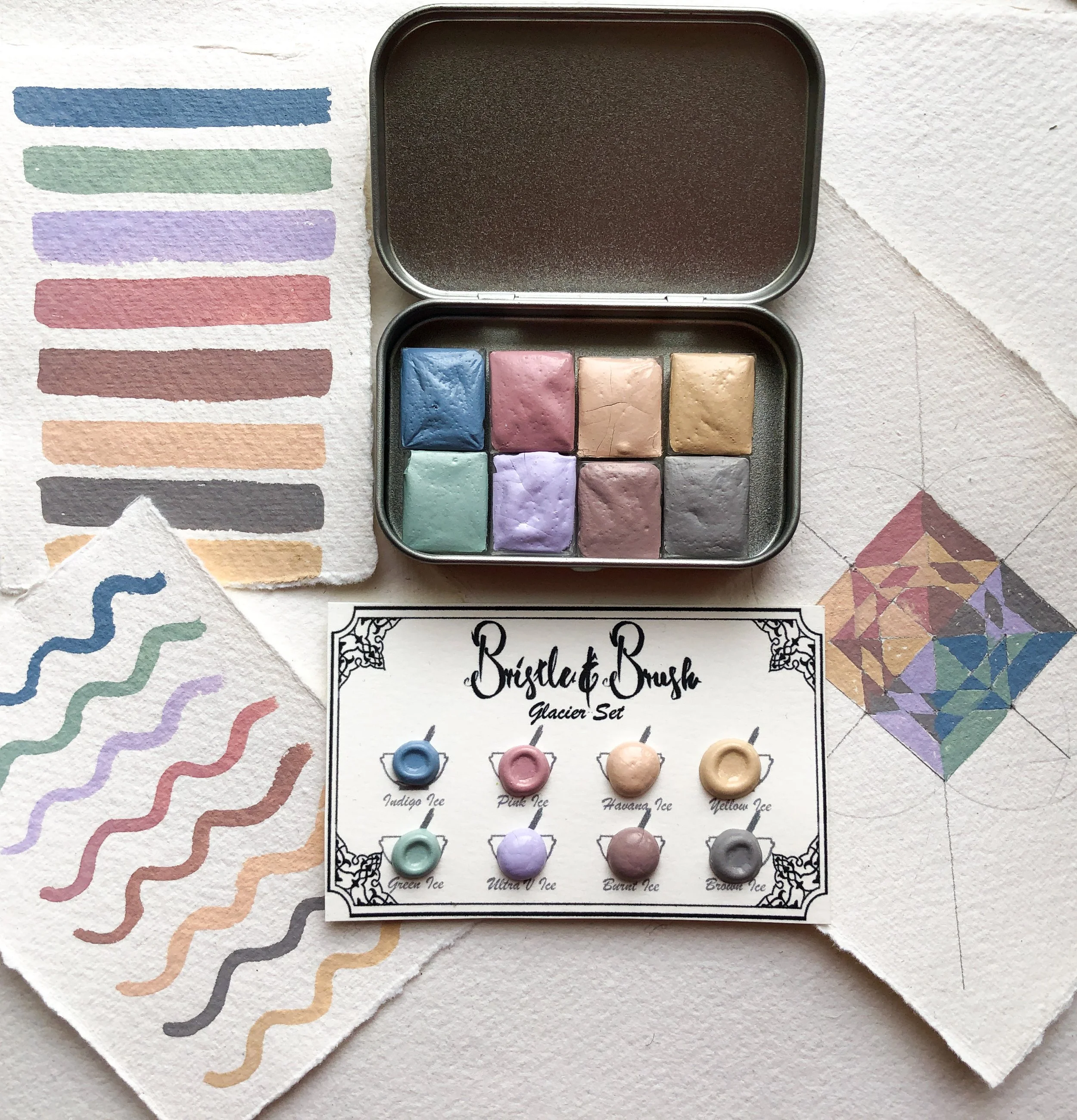
If your desires is only to pain with natural pigments then you are in the right place. That is the whole reason I started Bristle and Brush to have more natural pigments available and so far I have three natural pigments: The wonder set, the truly natural set and the travel slow set. However, they are a mix of Earth and mineral. The wonder set has two organics: Indigo (from a plant) and Carmine (from an insect). In terms of the surface, most of them are smooth, but the some of the minerals are going to make their presence known.

Happy to try human invention and synthetic paints
I was very apprehensive at first to add any manufactured/synthetic/human-made colours because what can be more beautiful than natural pigments? But colour choices are limited with natural pigments and you do not get super bright paints like you would with this synthetic range. If your goal is to have bright, fun and vibrant paintings then the summer vibes set is the rand that you need. Since most of these are made in a lab, their surface is VERY soft and smooth on the paper.

Your Budget
We can’t pretend that money is not a factor, so think of you budget as well. Can you invest in a mineral set in the time being or would you rather start with a limited palette of individual pans? Take a little look at your average paint spending. How often do you buy a set? How long does it last? How big are you painting pieces? It might be better to maybe buy a full pan instead of half pans if you paint bigger and require more colours.
There are few things that you need to consider to make your choice, but once you know what you want you will be more focused on creating the artwork itself.
More reads from the blog:


Shop Bristle and Brush Paints: